css를 사용하여 3D를 만들수 있다.

perspective 속성을 사용하여 원근감을 적용시켜준다.

perspective 속성

perspective 속성은 3D 위치 요소에 약간의 원근감을 주기 위해 z=0 평면과 사용자 사이의 거리를 결정한다.

transform 효과를 주고자하는 부모 요소에 적용.

  • perspective 에 따른 변형 호과
    • perspective가 클수록 (거리가 멀수록) 변형 효과가 적음
    • perspective가 작을수록(거리가 가까울수룩) 변형 효과가 큼
/* Keyword value */
perspective: none;

/* <length> values */
perspective: 20px;
perspective: 3.5em;

/* Global values */
perspective: inherit;
perspective: initial;
perspective: revert;
perspective: revert-layer;
perspective: unset;


예제

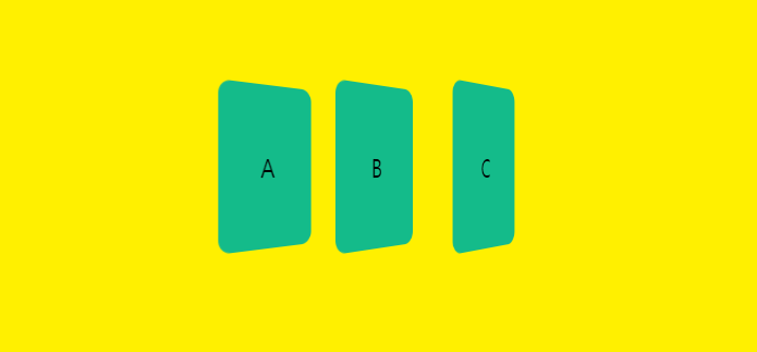
<div class="card-form">
    <div class="card">A</div>
    <div class="card">B</div>
    <div class="card">C</div>
</div>


공간에서 보는 시점에서 3D효과를 주게되면 각각의 카드가 원근감에따라 다르게 나타난다.

.card-form {
    display: flex;
    align-items: center;
    justify-content: center;
    width: 60vw;
    height: 60vh;
    background: #fff000;
    perspective: 500px;
}
.card {
    display: flex;
    align-items: center;
    justify-content: center;
    width: 100px;
    height: 150px;
    border-radius: 0.5em;
    font-size: 1.5rem;
    background: #14bb8a;
    transform: rotateY(45deg);
}


회전되는 요소 자체에 3D효과를 주려면 아래예제 코드처럼 카드요소의 transform안에서 perspective 속성을 부여해준다.

.card-form {
    display: flex;
    align-items: center;
    justify-content: center;
    width: 60vw;
    height: 60vh;
    background: #fff000;
}
.card {
    display: flex;
    align-items: center;
    justify-content: center;
    width: 100px;
    height: 150px;
    border-radius: 0.5em;
    font-size: 1.5rem;
  	background: #14bb8a;
    transform: perspective(500px) rotateY(45deg);
}

카드 뒤집기 예제

transform-style 속성 사용 (IE미지원)

See the Pen Untitled by KangJi (@Kangjii) on CodePen.


transform-style

요소의 자식이 3D 공간에 배치되는지 또는 요소 평면에서 병합되는지 여부를 설정한다.

ie 미지원

transform-style: flat; /* 요소의 자식이 요소 자체의 평면에 있음 */
transform-style: preserve-3d; /* 요소의 자식이 3D 공간에 배치 */


backface-visibility

-webkit-backface-visibility: hidden;
backface-visibility: hidden;


최종 (IE, Safari 지원)

See the Pen Untitled by KangJi (@Kangjii) on CodePen.


https://developer.mozilla.org/ko/docs/Web/CSS/backface-visibility


backface-visibility - CSS: Cascading Style Sheets | MDN

CSS backface-visibility 속성은 요소의 뒷면이 사용자를 향할 때 보여야 하는지 지정합니다.

developer.mozilla.org


https://developer.mozilla.org/en-US/docs/Web/CSS/transform-style


transform-style - CSS: Cascading Style Sheets | MDN

The transform-style CSS property sets whether children of an element are positioned in the 3D space or are flattened in the plane of the element.

developer.mozilla.org


반응형

1. image-rendering

이미지 랜더링 방식을 바꾼다.

원본이미지 사이즈를 그래도 사용하면 상관없지만 해당 이미지를 확대, 축소할 경우 효과를 볼 수 있다. 

크롬, 사파리 등 브라우저에서 대비를 최적화하여 이미지 랜더링을 하는데 흐린 문제를 해결해줌.

image-rendering: -moz-crisp-edges; /* firefox */
image-rendering: -o-crisp-edges; /* opera */
image-rendering: -webkit-optimize-contrast; /* chrome */
image-rendering: crisp-edges;


2. translateZ

z축을 0으로 적용하여 깊이감을 없앤다. 

transform: translateZ(0);


3. backface-visibility

뒷면을 hidden처리하여 입체감을 없앤다.

backface-visibility: hidden;


반응형

특정 CSS문제가 생기지 않도록 하는 스니펫 콜렉션

이미지 늘려짐/찌그러짐 방지

object-fit: cover;


Flexbox 줄바꿈

flex-wrap: wrap;


고정 높이 -> height 보다는 min-height ,고정 너비 -> width  보다는 min-width 사용

min-width: 320px;
min-height: 980px;


CSS 변수 폴백 값 주기

max-width: calc(100% - var(--actions-width, 70px));


줄바꿈 되지 않아야할 긴 콘텐츠 

text-overflow: ellipsis; white-space:nowrap; overflow: hidden;


스크롤 연쇄 잠금

overscroll-behavior-y: contain;


배경 반복 제거

background-repeat: no-repeat;


필요할때만 스크롤바 보이기

overflow-y: auto;


스크롤바 생길때 레이아웃 변화 없애기

scrollbar-gutter: stable;


Flexbox 에서 최소 콘텐츠 사이즈 지정

min-width: 0; /*기본값이 auto 여서 overflow 발생*/


CSS Grid에서 최소 콘텐츠 사이즈 지정 minmax() 사용

Flexbox 아이템 배열시 justify-content: space-between; 대신 gap: 1rem; 사용

gap: 1rem;


이미지 최대 넓이 지정

max-width: 100%


이미지 위에 하얀 텍스트 올리때 이미지 로딩 실패시 대응

background-color: grey;


- 버티컬 미디어 쿼리 활용 → position:sticky 같은거 쓸 때 특정 세로크기 이상에서만 적용 @media (min-height:600px) {}
- CSS Grid 위에서 고정 값 사용은 조심 → 항상 미디어 쿼리 사용할 것
- CSS Grid 사용시 Auto Fit vs. Auto Fill → 대부분의 경우 auto-fill 이 나음
- 그리드 컨테이너 차일드에 postition: sticky 사용시 align-self: start 적용
- 그룹 셀렉터 지정은 다른 브라우저에서는 안될수 있으니 각각으로 분리할 것


https://developer.mozilla.org/ko/docs/Web/CSS/var() 


var() - CSS: Cascading Style Sheets | MDN

CSS var() 함수는 사용자 지정 속성 (en-US), 또는 "CSS 변수"의 값을 다른 속성의 값으로 지정할 때 사용합니다.

developer.mozilla.org

A Complete Guide to Flexbox

https://css-tricks.com/snippets/css/a-guide-to-flexbox/


A Complete Guide to Flexbox

Our comprehensive guide to CSS flexbox layout. This complete guide explains everything about flexbox, focusing on all the different possible properties for the parent element (the flex container) a…

css-tricks.com


Best CSS Code Snippet Sites

https://css-tricks.com/snippets/


Code Snippets

Visit the post for more.

css-tricks.com

https://snipplr.com/


Code Snippet - Snipplr Social Repository


snipplr.com

https://stackoverflow.com/questions/tagged/css


Newest 'css' Questions

Stack Overflow | The World’s Largest Online Community for Developers

stackoverflow.com


본문 참고 https://news.hada.io/topic?id=5512 


방어적(Defensive) CSS | GeekNews

특정 CSS문제가 생기지 않도록 하는 스니펫 콜렉션- Flexbox 줄바꿈 → flex-wrap: wrap;- 여유 공간 주기 → margin-right: 1rem;- 줄바꿈 되지 않아야할 긴 콘텐츠 → text-overflow: ellipsis; white-space:nowrap; overflow:

news.hada.io


반응형


<button class="btn draw-outline">Draw button</button>
/* scss */
@mixin btn-border-outline($color: #ccc, $hover: black, $width: 2px, $vertical: top, $horizontal: left, $direction: horizontal, $duration: 0.25s) {
  $h-side: if($horizontal == 'left', 'right', 'left');
  $v-side: if($vertical == 'top', 'bottom', 'top');

  $dir-1: 'height';
  $dir-2: 'width';
  $pseudo-1: 'after';
  $pseudo-2: 'before';
  
  @if($direction == 'horizontal') {
    $dir-1: 'width';
    $dir-2: 'height';
    $pseudo-1: 'before';
    $pseudo-2: 'after';
  }
  
  box-shadow: inset 0 0 0 $width $color;
  color: $color;
  transition: color $duration $duration/2;
  position: relative;

  &::before,
  &::after {
    border: 0 solid transparent;
    box-sizing: border-box;
    content: '';
    pointer-events: none;
    position: absolute;
    width: 0; height: 0;
  }

  &::before {
    #{$vertical}: 0; 
    #{$horizontal}: 0;
  }
  
  &::after {
    #{$h-side}: 0;
    #{$v-side}: 0;
  }

  &::#{$pseudo-1} {
    border-#{$vertical}-width: $width;
    border-#{$h-side}-width: $width;
  }

  &::#{$pseudo-2} {
    border-#{$v-side}-width: $width;
    border-#{$horizontal}-width: $width;
  }
  
  &:hover {
    color: $hover;
    
    &::before,
    &::after {
      border-color: $hover;
      transition: border-color 0s, unquote($dir-1) $duration,  unquote($dir-2) $duration;
      width: 100%;
      height: 100%;
    }
    
    &::before { transition-delay: 0s, 0s, $duration; }
    &::after { transition-delay: $duration * 2, $duration * 2, $duration * 3; }
  }
}


.draw-outline {
  @include btn-border-outline(#c994bd, #90f183, 4px, top, right, vertical);
}

//=== Button styling, semi-ignore
.btn {
  background: none;
  border: none;
  cursor: pointer;
  line-height: 1.5;
  font: 700 1.2rem 'Roboto Slab', sans-serif;
  padding: 1em 2em;
  letter-spacing: 0.05rem;
  
  &:focus { outline: 2px dotted #55d7dc; }
}

//=== Pen styling, ignore
body { 
  background: #1a1f25;
  display: flex; 
  align-items: center;
  justify-content: center;
  min-height: 100vh;
}


https://codepen.io/giana/pen/yYBpVY


반응형

http://rwdb.kr/ratio_calc/


반응형웹, CSS만으로 background-image 의 종횡비 유지하기

RWDB Responsive Web Design dB Web awards, 우수 하이브리드웹·반응형웹 모음 사이트

rwdb.kr

width:1000px; height:300px; 을 기준으로 하며, 종횡비를 유지해야하는 컨텐츠

.background {
	width : 100 %;
	height : 0;
	padding-top : calc (300 / 1000 * 100 %); / * calc (이미지 높이 ÷ 이미지 가로 × 100 %) * /
	background : url (bg.jpg) center center / cover no-repeat;
}

padding-top 또는 padding-bottom 의 값은 “이미지 높이 ÷ 이미지 가로 × 100″

반응형

PNG 파일 CSS로 색상 변경하기

.button { 
    width: 40px; height:40 px
    background:rgb(0,35,255); 
	-webkit-mask-box-image:url('...png');
	mask-image: url('...png');
	background-position:center;  background-size:cover;  position:relative; 
}

.button:hover{ 
	transition:0.4s;  background:rgba(0,35,255,0.8);
}


SVG파일 CSS로 색상 변경하기

주의: mask-image는 ie 브라우저 미지원!!!  
height: 50px;

/* Background Option 1: Use a background-color as the fill */
background-color: red;

/* Background Option 2: Use a background-image as the fill */
background-image: url(background.png);

/* Syntax Option 1: mask shorthand */
mask: url(icon.svg) no-repeat 50% 50%;
-webkit-mask: url(icon.svg) no-repeat 50% 50%;

/* Syntax Option 2: mask-image only */
mask-image: url(icon.svg);
-webkit-mask-image: url(icon.svg);


반응형

 하단에 footer 고정


https://m.blog.naver.com/PostView.nhn?blogId=eggtory&logNo=220744380205&proxyReferer=https%3A%2F%2Fwww.google.com%2F

페이지의 하단에 footer 고정 시키기


position:fixed를 사용하면 컨텐츠 양에 상관 없이 항상 브라우져 하단에 고정되어 있는 footer를 보게 됩니다.

컨텐츠 양이 많을 경우 컨텐츠가 끝나는 지점에 footer를 고정시키기 위해서는 아래와 같이 심플한 소스를 사용하시면 됩니다.


<div id="wrapper">
    <div id="header">header</div>
    <div id="container">나는 container입니다.
 </div>
 <div id="footer">footer</div>
</div>
html,
body {
    margin:0;
    padding:0;
    height:100%;
}

#wrapper {
    position:relative;
    min-height:100%;
}
#header {
    height:70px;
    background:#ccc;
}

#container {
  	padding:20px;
}

#footer {
    position:absolute;
    bottom:0;
    width:100%;
    height:70px;   
    background:#ccc;
}
반응형

상대적인 값 

em

타이포그래피에서 현재 지정된 포인트 사이즈를 나타내는 단위

부모 사이즈의 상대적으로 크기가 계산되어 진다.

<div class="parent">
	parent
	<div class="child"> child</div>
</div>
.parent {
	font-size: 8em; /* 128px */
}
.child {
	font-size: 0.5em; /* 64px */
}


브라우저에서 HTML에 할당되는 기본폰트 사이즈는 16px이다.

.parent 사이즈가 8em이라는 것은 부모요소인 HTML16px의 8배가 곱해진 값.

.parent는 16px * 8 = 128px 로 브라우저에 표기됨.

parent안에 있는 .child의 폰트사이즈 0.5em은 부모인 parent의 0.5배가 계산되어진 128px * 0.5 = 64px 로 브라우저에 표기가 된다.

이때 %로 지정할 경우의 폰트사이즈는 .parent 는 800% 가되고  .child는 부모의 폰트사이즈에서  50%로 나타낼 수 잇다. 동일한 결과값이 나옴. 


rem

em에서 root를 나태는 r이 더해진 단위로 부모에 따라 사이즈가 계산되는 것이 아니라 

루크에 지정된 폰트사이즈에 따라 크기가 결정되는 단위. 

.parent {
	font-size: 8rem;  /* 128px */
}
.child {
	font-size: 0.5rem; /* 8px */
}


viewport 에 관련된 단위 (vw, vh, vmin, vmax)

vw

  • 100vw는 viewport width 너비의 100%로 쓴 값
  • 50vw는 viewport width 너비의 50%로 사이즈를 지정한다. 

vh

  • viewport height 

vmin

  • vmin은 브라우저의 너비와 높이 중 작은 값의 50%

vmax

  • vmax는 라우저의 너비와 높이 중 큰 값의 50%


%

부모요소의 상대적으로 크기가 계산되는 단위

위의 em대신 %로 계산하게 되면 아래와 같다. 

.parent {
	font-size: 800%; /* 128px */
}
.child {
	font-size: 50%; /* 64px */
}


총정리

부모요소의 사이즈에 따라서 사이즈가 변경되야한ㄴ다면 %나 em과 같은 단위를 사용한다.

부모와 상관없이 브라우저 기준의 사이즈에따라 반응해야하면 부포트단위인 vm,vh나 rem을 사용하면된다. 


요소의 너비와 높이에 따라 사이즈가 변경되야하면 %나 부포트단위인 vm,vh를 사용하면 된다. 

폰트사이즈에 따라서 사이즈가 반응해야하면 em과 rem을 사용한다. 


예제 

버튼의 컴포넌트

버튼의 폰트를 rem을 사용해서 만들게되면 root의 폰트사이즈에 다라 크기가 결정되기 때문에 

최상단의 body나 다른 컴포넌트 안에서 사용할때와 크기의 변동사항이없다. 

em을 사용해서 만든다면 body에 서 사용할때와 부모요소에서 사용햇을대 크기차이가 달라지게 된다.


페이지 어디에서 사용되어져도 사이즈가 그대로 고정되야한다면 rem

어디에서 사용되냐에따라 사이즈가 유동적으로 변경되야하면 em을 사용한다. 


html 예제

<body>
    <div class="level1">
        <h1>level 1</h1>
        <div class="level2">
            <h1>level 2</h1>
            <div class="level3">
                <h1>level 3</h1>
                <div class="level4">
                    <h1>level 4</h1>
                </div>
            </div>
        </div>
    </div>
</body>

em 예제

body { font-size: 16px; }
.level1 { font-size: 2em; /* 32px */ }
.level2 { font-size: 2em; /* 64px */ }
.level3 { font-size: 2em; /* 128px */ }
.level4 { font-size: 2em; /* 256px */ }

rem 예제

body { font-size: 16px; }
.level1 { font-size: 2rem; /* 32px */ }
.level2 { font-size: 2rem; /* 32px */ }
.level3 { font-size: 2rem; /* 32px */ }
.level4 { font-size: 2rem; /* 32px */ }


반응형


기본

See the Pen Untitled by KangJi (@Kangjii) on CodePen.


flex 사용

See the Pen Untitled by KangJi (@Kangjii) on CodePen.


flex-direction

축의 방향

flex-direction: row 가 기본.

/* 한 줄의 글을 작성하는 방향대로 */
flex-direction: row;

/* <row>처럼, 대신 역방향 */
flex-direction: row-reverse;

/* 글 여러 줄이 쌓이는 방향대로 */
flex-direction: column;

/* <column>처럼, 대신 역방향 */
flex-direction: column-reverse;

/* 전역 값 */
flex-direction: inherit;
flex-direction: initial;
flex-direction: unset;


justify-content

justify-content: flex-start;  기본값

/* Positional alignment */
justify-content: center;     /* Pack items around the center */
justify-content: start;      /* Pack items from the start */
justify-content: end;        /* Pack items from the end */
justify-content: flex-start; /* 축에서 시작지점 */
justify-content: flex-end;   /* 축에서 끝지점 */
justify-content: left;       /* Pack items from the left */
justify-content: right;      /* Pack items from the right */

/* Baseline alignment */
/* justify-content does not take baseline values */

/* Normal alignment */
justify-content: normal;

/* Distributed alignment */
justify-content: space-between; /* 축을 기준으로 균일하게 정렬 */
justify-content: space-around;  /* Distribute items evenly
                                   Items have a half-size space
                                   on either end */
justify-content: space-evenly;  /* Distribute items evenly
                                   Items have equal space around them */
justify-content: stretch;       /* Distribute items evenly
                                   Stretch 'auto'-sized items to fit
                                   the container */

/* Overflow alignment */
justify-content: safe center;
justify-content: unsafe center;

/* Global values */
justify-content: inherit;
justify-content: initial;
justify-content: revert;
justify-content: revert-layer;
justify-content: unset;


justify-content: space-between; 


See the Pen Untitled by KangJi (@Kangjii) on CodePen.


align-items

/* Basic keywords */
align-items: normal;
align-items: stretch;

/* Positional alignment */
/* align-items does not take left and right values */
align-items: center; /* Pack items around the center */
align-items: start; /* Pack items from the start */
align-items: end; /* Pack items from the end */
align-items: flex-start; /* Pack flex items from the start */
align-items: flex-end; /* Pack flex items from the end */

/* Baseline alignment */
align-items: baseline;
align-items: first baseline;
align-items: last baseline; /* Overflow alignment (for positional alignment only) */
align-items: safe center;
align-items: unsafe center;

/* Global values */
align-items: inherit;
align-items: initial;
align-items: revert;
align-items: revert-layer;
align-items: unset;


Flex 속성


flex-grow

flex-grow만을 사용할경우 각 여백에 대한 비율로 조정되기 때문에 의도한바로 너비를 지정하기 어렵다. 

/* <number> values */
flex-grow: 1;
flex-grow: 0.6;

/* Global values */
flex-grow: inherit;
flex-grow: initial;
flex-grow: unset;

See the Pen Untitled by KangJi (@Kangjii) on CodePen.


flex-basis

flex-basis:auto가 기본속성값

flex-basis:0으로 해주게되면 의도하는 정확한 비율대로 나눌수 있어 사용하기에 효율적이다. 

/* <'width'> 지정 */
flex-basis: 0;
flex-basis: 10em;
flex-basis: 3px;
flex-basis: auto;

/* 원본 크기 키워드 */
flex-basis: fill;
flex-basis: max-content;
flex-basis: min-content;
flex-basis: fit-content;

/* 플렉스 아이템 내용 크기에 따라 조절 */
flex-basis: content;

/* 전역 값 */
flex-basis: inherit;
flex-basis: initial;
flex-basis: unset;


See the Pen Untitled by KangJi (@Kangjii) on CodePen.


Flex 축약형으로 사용하기

See the Pen Untitled by KangJi (@Kangjii) on CodePen.


반응형

Animation 

엘리먼트에 적용되는 CSS 스타일을 다른 CSS 스타일로 부드럽게 전환시켜준다.

애니메이션은 애니메이션을 나타내는 CSS 스타일과 애니메이션의 중간 상태를 나타내는 키프레임들로 이루어진다.

Animation 속성

Animation 축약형 예시

@keyframes sample-ani {
    0% {
        transform: translate(0, 0);
    }
    50% {
        background: red;
        transform: translate(300px, 0);
    }
    100% {
        transform: translate(400px, 500px);
    }
}
.box {
    display: flex;
    align-items: center;
    justify-content: center;
    width: 100px;
    height: 100px;
    border: 2px solid #000;
    background: #fff000;
    animation: sample-ani 2s linear forwards 3;
}

개발자도구에서 확인하기


1. animation-duration

한 싸이클의 애니메이션이 얼마에 걸쳐 일어날지 지정

/* Single animation */
animation-duration: 6s;
animation-duration: 120ms;

/* Multiple animations */
animation-duration: 1.64s, 15.22s;
animation-duration: 10s, 35s, 230ms;


2. animation-timing-function 

가속도를 지정해준다. 중간 상태들의 전환을 어떤 시간간격으로 진행할지 지정

transition때와 마찬가지로 개발자도구에서 제공되는 cubic-bezier 에디터를 사용하여 적용할 수 있다. 

축약 속성 animation를 사용하여 모든 애니메이션 속성을 한꺼번에 설정하는 것이 편리하다.

/* Keyword values */
animation-timing-function: ease; /* 애니메이션 중간까지 속도가 올라가고 중간 이후 느려짐 cubic-bezier(0.25, 0.1, 0.25, 1.0) */
animation-timing-function: ease-in; /* 천천히 시작해 끝날때까지 빨라짐 cubic-bezier(0.42, 0, 1.0, 1.0)  */
animation-timing-function: ease-out; /* 빨리 시작해 점점 느려짐 cubic-bezier(0, 0, 0.58, 1.0)  */
animation-timing-function: ease-in-out; /* 천천히 시작했다 빨라지고 다시 느려지며 끝남 cubic-bezier(0.42, 0, 0.58, 1.0) */
animation-timing-function: linear; /* 등속 cubic-bezier(0, 0, 1.0, 1.0) */
animation-timing-function: step-start;
animation-timing-function: step-end;

/* Function values */
animation-timing-function: cubic-bezier(0.1, 0.7, 1.0, 0.1);
animation-timing-function: steps(17); 
animation-timing-function: steps(4, end);

/* Steps Function keywords */
animation-timing-function: steps(4, jump-start);
animation-timing-function: steps(10, jump-end);
animation-timing-function: steps(20, jump-none);
animation-timing-function: steps(5, jump-both);
animation-timing-function: steps(6, start);
animation-timing-function: steps(8, end);

/* Multiple animations */
animation-timing-function: ease, step-start, cubic-bezier(0.1, 0.7, 1.0, 0.1);

/* Global values */
animation-timing-function: inherit;
animation-timing-function: initial;
animation-timing-function: revert;
animation-timing-function: revert-layer;
animation-timing-function: unset;

cubic-bezier

+ 베지어 곡선 이란?

컴퓨터 그래픽 등에서 사용되는 매개변수 곡선으로 부드러운 곡선을 만드는데 이용.

폰트 애니메이션 등에 사용.

cubic-bezier는 베지어 곡선을 정의하는 함수로 

4개의 포인트 (P0, P1, P2, P3)로 정의한다.


https://cubic-bezier.com/#.17,.67,.83,.67


cubic-bezier.com


cubic-bezier.com


3. animation-delay

애니메이션의 시작할 시점을 지정한다. 시작 즉시, 잠시 후에, 또는 애니메이션이 일부 진행한 시점부터 시작할 수 있다.

/* Single animation */
animation-delay: 3s;
animation-delay: 0s;
animation-delay: -1500ms;

/* Multiple animations */
animation-delay: 2.1s, 480ms;


4. animation-iteration-count 

- 몇 번 반복될지 지정한다.

animation-iteration-count: 3;         /* 3번 반복 */
animation-iteration-count: infinite;  /* 무한 반복 */


5. animation-delection

애니메이션이 앞으로, 뒤로 또는 앞뒤로 번갈아 재생되어야하는지 여부를 지정한다..

/* Single animation */
animation-direction: normal;
animation-direction: reverse; 	/* 반대로 재생 */
animation-direction: alternate; /* 출발에서 끝. 끝에서 출발지점으로 번갈아가며 재생 */
animation-direction: alternate-reverse;  /* 출발은 반대부터 시작하여 번갈아가며 재생 */

/* Multiple animations */
animation-direction: normal, reverse;
animation-direction: alternate, reverse, normal;

/* Global values */
animation-direction: inherit;
animation-direction: initial;
animation-direction: unset;


6. animation-fill-mode

 애니메이션의 실행 전과 후에 대상에 스타일을 적용하는 방법을 지정한다..

/* Single animation */
animation-fill-mode: none;
animation-fill-mode: forwards; /* 끝나는 시점의 위치로 지정*/
animation-fill-mode: backwards;
animation-fill-mode: both;

/* Multiple animations */
animation-fill-mode: none, backwards;
animation-fill-mode: both, forwards, none;


7. animation-play-state

애니메이션이 실행 중인지 일시 중지되었는지 설정한다.

hover일때 paused를 지정해주면 마우스오버했을대 멈추를 효과를 줄 수 있다.

/* Single animation */
animation-play-state: running;
animation-play-state: paused;

/* Multiple animations */
animation-play-state: paused, running, running;

/* Global values */
animation-play-state: inherit;
animation-play-state: initial;
animation-play-state: revert;
animation-play-state: revert-layer;
animation-play-state: unset;


8. animation-name

@keyframes 규칙을 이용

.box {
	animation-name: sample-ani;
}

@keyframes sample-ani {
    0% {
        transform: translate(0, 0);
    }
    50% {
        background: red;
        transform: translate(300px, 0);
    }
    100% {
        transform: translate(400px, 500px);
    }
}


https://developer.mozilla.org/ko/docs/Web/CSS/CSS_Animations/Using_CSS_animations


CSS 애니메이션 사용하기 - CSS: Cascading Style Sheets | MDN

CSS3 애니메이션은 엘리먼트에 적용되는 CSS 스타일을 다른 CSS 스타일로 부드럽게 전환시켜 줍니다. 애니메이션은 애니메이션을 나타내는 CSS 스타일과 애니메이션의 중간 상태를 나타내는 키프

developer.mozilla.org


반응형

Transition

CSS 트랜지션은 CSS 속성을 변경할 때 애니메이션 속도를 조절하는 방법을 제공.

속성 변경이 즉시 영향을 미치게 하는 대신, 그 속성의 변화가 일정 기간에 걸쳐 일어나도록 할 수 있습니다. 예를 들어, 여러분이 어떤 요소의 색상을 흰색에서 검은색으로 변경한다면, 변화는 대개 즉시 일어납니다. CSS 트랜지션을 이용하면, 모두 커스터마이즈 가능한 어떤 가속도 곡선을 따르는 시간 주기마다 변화가 일어납니다.


Transition 속성

1. transition 사용하기

- transition을 사용하면 제공되는 모든요소가 기본으로 사용된다.

transition: 1s 2s;  /* duation, delay */


2. transition-property: all; 모든요소의 transition을 사용하겠다.

transition-property: all /* 모든요소 사용 */


3. transition-duration 재생시간 

transition-duration: 1s;


4. transition-timing-function  가속도

transition-timing-function: ease;    /*기본값*/
transition-timing-function: linear;  /*등속도(동일한속도)*/
transition-timing-function: ease-in-out;
transition-timing-function: cubic-bezier(0.01, 0.82, 0.54, 1.19);

개발자도구에서 속성값 ease앞에 있는 아이콘을 클릭하여 cubic bezier Editor를 열면

transition 의 동작을 나타내주는 그래프를 볼 수 있고 그래프의 각 x축과 y축에있는 원형을 움직여 효과를 변경해줄 수 있다. 


5. transition-delay: 시작시간

transition-delay: 2s; /* 2초 후에 실행된다*/


width, backround-color, font-size 등 수치로 표현되는 변화값을 transition 줄 수 있다. 


반응형

Transform


Transform 속성

1. scale()  :  X 또는 Y축으로 확대/ 축소

transform: scaleX(2);          /* X축으로 비율만큼 확대, 축소 */
transform: scaleY(2);          /* y축으로 비율만큼 확대, 축소 */
transform: scale(2, 2);        /* x축, y축으로 비율만큼 확대, 축소 */


2. rotate()  : 지정 요소 회전

transform: rotateX(15deg);  /* x축 기준으로 15deg 만큼 회전 */
transform: rotateY(15deg);  /* y축 기준으로 15deg 만큼 회전 */
transform: rotate(-15deg);  /* -15deg 만큼 회전 */


3. translate() : 지정 요소 X 또는 Y축으로 이동

transform: translateX(10px);        /* X축으로 이동 */
transform: translateY(10px);        /* Y축으로 이동 */
transform: translate(20px, -10px);  /* X축, Y축으로 이동 */


4. skew() : 지정 요소 X 또는 Y축으로 기울이기

transform: skewX(15deg);          /* x축으로 15deg 만큼 기울이기 */
transform: skewY(15deg);          /* y축으로 15deg 만큼 기울이기 */
transform: skew(15deg, 15deg);    /* x축, y축으로 15deg 만큼 기울이기 */


transform-origin 속성 

지정요소의 기준점 변경하기

transform-origin: right bottom;  // px, 백분율(%), top, left, center, right, bottom


반응형
css_position

CSS 포지션(position) 속성

태그들의 위치를 결정하는 CSS

정적, 상대적, 고정, 절대 또는 고정을 지정

  • static
  • relative
  • absolute
  • fixed
  • sticky

position속성을 설정 한 후 top, right, bottom, left 속성을 사용해 위치 조절이 가능.


static (기본값)

- 일단 모든 태그들은 처음에 position: static (정적으로 배치) 상태. (기본적으로 static이라 따로 써주지 않아도 됨.)

- 차례대로 왼쪽에서 오른쪽, 위에서 아래로 쌓인다.

- static을 사용하면 top,right, bottom, left를 설정해도 적용되지 않는다.


relative

태그의 위치를 변경하고 싶을때 position: relative를 사용

이후 top, right, bottom, left 속성을 사용해 위치 조절이 가능.

기존에 자리를 잡던 위치를 기준으로 위치를 잡는다. (상대적인 위치)

방향으로 주어진 px만큼 이동.


absolute

가장 가까운 위치에 있는 조상과 관련해 배치됨.

문서 전체를 기준으로 위치를 잡는다. (절대적인 위치)

relative가 static인 상태를 기준으로 주어진 픽셀만큼 움직였다면 ,

absolute는 position: static 속성을 가지고 있지 않은 부모를 기준으로 움직임.

 만약 부모 중에 포지션이 relative, absolute, fixed인 태그가 없다면 가장 위의 태그(body)가 기준이 됨.

  • 절대위치 요소에 조상이 배치되어 있지 않으면 문서 전체기준에 움직인다.


fixed

특정위치에 고정되어있게 하는 position.

스크롤을 내려도 항상 같은 위치에 유지


sticky

with 요소 position: sticky는 사용자의 스크롤 위치를 기반으로 배치됨

뷰포트에서 지정된 오프셋 위치가 충족될 때 까지 상대적 위치에 배치 된 다음 위치에 고정됨.


참고 : Internet Explorer, Edge 15 및 이전 버전은 고정 위치 지정을 지원하지 않습니다. Safari에는 -webkit- 접두사가 필요합니다 (아래 예 참조). 또한 중 하나 이상 지정해야합니다 toprightbottom또는 left끈적 위치가 작동 할 수 있습니다.


전체기준이 아닌 부모를 기준으로 위치를 잡고 싶을 때

부모가 relative이고 자식이 absolute라고 생각한다.

하위 class를 감싸고 있는 상위 classrelative를 적용하고

하위classabsolute로 적용하면 , 해당 하위 classabsolute임에도 불구하고 문서 전체가 아닌 relative속성을 가진 부모(상위) class를 기준으로 위치를 선정하여 부모위치를 기준으로 위치를 잡게된다.


absolute와 relative가 만나면 상대적으로 절대적인 위치를 잡는다.


겹치는 요소

요소가 배치되면 다른 요소와 겹칠 수 있다.

z-index 속성으로 요소의 스택 순서를 지정할 수 있다. (요소는 다른 요소의 앞에 또는 뒤에 있어야한다.)

요소는 양수 또는 음수 스택 순서를 가질 수 있다.

더 큰 스택 순서를 갖는 요소는 항상 스택 순서가 낮은 요소 앞에 위치!


참고 : 두 개의 배치 된 요소가 z-index 지정 없이 겹치면 HTML 코드의 마지막에 배치 된 요소가 맨 위에 표시됩니다.


반응형
css_float

CSS - float 속성

CSS 속성(property) float 은 웹 페이지의 배치 및 레이아웃에 사용된다.

한 요소(element)가 보통 흐름(normal flow)으로부터 빠져 텍스트 및 인라인(inline) 요소가 그 주위를 감싸는 자기 컨테이너의 좌우측을 따라 배치되어야 함을 지정

float은 block 레이아웃이기 때문에, 경우에따라 display 계산 값을 수정한다.


지정값계산값
inlineblock
inline-blockblock
inline-tabletable
table-rowblock
table-row-groupblock
table-columnblock
table-column-groupblock
table-cellblock
table-cationblock
table-header-groupblock
table-footer-groupblock
flexflex ( float은 효과 없음 )
inline-flexinline-flex ( float은 효과 없음 )
그외변화없음


주의: JavaScript에서 이 속성을 element.style 객체의 멤버로서 참조한다면,  cssFloat으로 철자를 써야 합니다. 또한 Internet Explorer 8 이전 버전에서는 styleFloat으로 썼음을 주의하세요. 이는 DOM 멤버의 이름은 dash(-)로 구분된 CSS 이름의 카멜케이스(camel-case) 명이다는 규칙의 예외(이고 "class"는 "className"으로 


  • left

    left는 요소가 자신을 포함하고 블록의 좌측에 부동해야 함


  • right

    right는 요소가 자신의 포함 블록의 우측에 부동해야 함을 나타내는 키워드


  • none

    기본값 . 요소가 부동하지 않아야 함을 나타내는 키워드  (텍스트에서 나타나는 위치에 표시)


  • inline-start

     요소가 자신의 포함 블록의 시작쪽에 부동해야 함을 나타내는 키워드입니다.

    즉, ltr(left to right) 스크립트 상에서 왼쪽 그리고 rtl(right to left) 스크립트 상에서는 오른쪽


  • inline-end

    요소가 자신의 포함 블록의 끝쪽에 부동해야 함을 나타내는 키워드

    즉, ltr 스크립트 상에서 오른쪽 그리고 rtl 스크립트 상에서는 왼쪽.


형식구문

left | right | none | inline-start | inline-end

float 위치 지정

요소가 부동되면 문서의 보통 흐름에서 빠집니다. 부동된 요소는 포함 박스나 다른 부동된 요소의 가장자리(edge)에 닿을 때까지 좌나 우로 이동됩니다.


float 지우기

 float을 지우는 가장 간단한 방법은 우리가 왼쪽으로 정렬되는 지 확인하고 싶은 새 머릿글에 clear 속성을 추가하는 것

h2.secondHeading { clear: both; }

그러나, 이 방법은 우리가 머릿글이 가로로 옆에 계속 보이기를 원하는 같은 블록 형식 문맥(block formatting context) 내에 다른 요소가 없을 때만 동작합니다. 우리 h2 좌우로 부동되는 사이드바(sidebar)인 형제(sibling)가 있다면, clear 사용은 강제로 머릿글이 두 사이드바 아래로 나타나게 하고 이는 아마 우리가 원하는 게 아닙니다.


아래 요소의 float을 지우는 게 선택사항이 아니라면, 다른 방법(approach)은 부동 요소가 담긴 컨테이너의 블록 형식 문맥을 제한하는 겁니다. 다시 위 예제를 참조하면, 빨간 박스 셋은 모두 p 요소 내에 있는 걸로 보입니다. 우리는 박스를 포함하도록 늘어나지만, 그 하단 밖(밑)으로 사라지지 않게 hidden 혹은 auto 로 p의 overflow 속성을 설정할 수 있습니다:

p.withRedBoxes { overflow: hidden; height: auto; }


주의: overflow 를 scroll 로 설정하면 부동된 모든 자식(child) 요소도 포함합니다. 하지만 스크롤바가 콘텐츠의 높이에 상관없이 보입니다. 그 컨테이너가 콘텐츠를 수용하기 위해 늘어야(grow) 함을 나타내는 기본(default)임에도 불구하고, 여기에서 우리는 height 를 auto 로 설정하고 있습니다.


clearfix 해킹

요소가 포함 된 요소보다 크고 떠 다니는 경우 해당 요소가 컨테이너 외부에서 "오버플로"됩니다.

그런 다음 overflow: auto;이 요소를 포함하여이 문제를 해결할 수 있습니다.

.clearfix { overflow: auto; }

overflow: auto당신이 당신의 마진과 패딩 (다른 사람이 스크롤바를 볼 수 있습니다)의 제어를 유지할 수 있습니다로 clearfix 긴으로 잘 작동합니다. 그러나 새롭고 현대적인 clearfix 해킹 은 사용하는 것이 더 안전하며 다음 코드가 대부분의 웹 페이지에 사용됩니다 .

.clearfix::after { content: ""; clear: both; display: table; }


참고 링크 - https://developer.mozilla.org/ko/docs/Web/CSS/float

반응형

+ Recent posts