Animation
엘리먼트에 적용되는 CSS 스타일을 다른 CSS 스타일로 부드럽게 전환시켜준다.
애니메이션은 애니메이션을 나타내는 CSS 스타일과 애니메이션의 중간 상태를 나타내는 키프레임들로 이루어진다.
Animation 속성
Animation 축약형 예시
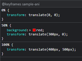
@keyframes sample-ani {
0% {
transform: translate(0, 0);
}
50% {
background: red;
transform: translate(300px, 0);
}
100% {
transform: translate(400px, 500px);
}
}
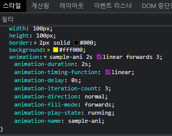
.box {
display: flex;
align-items: center;
justify-content: center;
width: 100px;
height: 100px;
border: 2px solid #000;
background: #fff000;
animation: sample-ani 2s linear forwards 3;
}개발자도구에서 확인하기
1. animation-duration
한 싸이클의 애니메이션이 얼마에 걸쳐 일어날지 지정
/* Single animation */
animation-duration: 6s;
animation-duration: 120ms;

/* Multiple animations */
animation-duration: 1.64s, 15.22s;
animation-duration: 10s, 35s, 230ms;
2. animation-timing-function
가속도를 지정해준다. 중간 상태들의 전환을 어떤 시간간격으로 진행할지 지정
transition때와 마찬가지로 개발자도구에서 제공되는 cubic-bezier 에디터를 사용하여 적용할 수 있다.
축약 속성 animation를 사용하여 모든 애니메이션 속성을 한꺼번에 설정하는 것이 편리하다.
/* Keyword values */
animation-timing-function: ease; /* 애니메이션 중간까지 속도가 올라가고 중간 이후 느려짐 cubic-bezier(0.25, 0.1, 0.25, 1.0) */
animation-timing-function: ease-in; /* 천천히 시작해 끝날때까지 빨라짐 cubic-bezier(0.42, 0, 1.0, 1.0)  */
animation-timing-function: ease-out; /* 빨리 시작해 점점 느려짐 cubic-bezier(0, 0, 0.58, 1.0)  */
animation-timing-function: ease-in-out; /* 천천히 시작했다 빨라지고 다시 느려지며 끝남 cubic-bezier(0.42, 0, 0.58, 1.0) */
animation-timing-function: linear; /* 등속 cubic-bezier(0, 0, 1.0, 1.0) */
animation-timing-function: step-start;
animation-timing-function: step-end;

/* Function values */
animation-timing-function: cubic-bezier(0.1, 0.7, 1.0, 0.1);
animation-timing-function: steps(17);
animation-timing-function: steps(4, end);

/* Steps Function keywords */
animation-timing-function: steps(4, jump-start);
animation-timing-function: steps(10, jump-end);
animation-timing-function: steps(20, jump-none);
animation-timing-function: steps(5, jump-both);
animation-timing-function: steps(6, start);
animation-timing-function: steps(8, end);

/* Multiple animations */
animation-timing-function: ease, step-start, cubic-bezier(0.1, 0.7, 1.0, 0.1);

/* Global values */
animation-timing-function: inherit;
animation-timing-function: initial;
animation-timing-function: revert;
animation-timing-function: revert-layer;
animation-timing-function: unset;
cubic-bezier
+ 베지어 곡선 이란?
컴퓨터 그래픽 등에서 사용되는 매개변수 곡선으로 부드러운 곡선을 만드는데 이용.
폰트 애니메이션 등에 사용.
cubic-bezier는 베지어 곡선을 정의하는 함수로
4개의 포인트 (P0, P1, P2, P3)로 정의한다.
https://cubic-bezier.com/#.17,.67,.83,.67
cubic-bezier.com
cubic-bezier.com
3. animation-delay
애니메이션의 시작할 시점을 지정한다. 시작 즉시, 잠시 후에, 또는 애니메이션이 일부 진행한 시점부터 시작할 수 있다.
/* Single animation */
animation-delay: 3s;
animation-delay: 0s;
animation-delay: -1500ms;

/* Multiple animations */
animation-delay: 2.1s, 480ms;
4. animation-iteration-count
- 몇 번 반복될지 지정한다.
animation-iteration-count: 3;         /* 3번 반복 */
animation-iteration-count: infinite;  /* 무한 반복 */
5. animation-delection
애니메이션이 앞으로, 뒤로 또는 앞뒤로 번갈아 재생되어야하는지 여부를 지정한다..
/* Single animation */
animation-direction: normal;
animation-direction: reverse; 	/* 반대로 재생 */
animation-direction: alternate; /* 출발에서 끝. 끝에서 출발지점으로 번갈아가며 재생 */
animation-direction: alternate-reverse;  /* 출발은 반대부터 시작하여 번갈아가며 재생 */

/* Multiple animations */
animation-direction: normal, reverse;
animation-direction: alternate, reverse, normal;

/* Global values */
animation-direction: inherit;
animation-direction: initial;
animation-direction: unset;
6. animation-fill-mode
애니메이션의 실행 전과 후에 대상에 스타일을 적용하는 방법을 지정한다..
/* Single animation */
animation-fill-mode: none;
animation-fill-mode: forwards; /* 끝나는 시점의 위치로 지정*/
animation-fill-mode: backwards;
animation-fill-mode: both;

/* Multiple animations */
animation-fill-mode: none, backwards;
animation-fill-mode: both, forwards, none;
7. animation-play-state
애니메이션이 실행 중인지 일시 중지되었는지 설정한다.
hover일때 paused를 지정해주면 마우스오버했을대 멈추를 효과를 줄 수 있다.
/* Single animation */
animation-play-state: running;
animation-play-state: paused;

/* Multiple animations */
animation-play-state: paused, running, running;

/* Global values */
animation-play-state: inherit;
animation-play-state: initial;
animation-play-state: revert;
animation-play-state: revert-layer;
animation-play-state: unset;
8. animation-name
@keyframes 규칙을 이용
.box {
	animation-name: sample-ani;
}

@keyframes sample-ani {
    0% {
        transform: translate(0, 0);
    }
    50% {
        background: red;
        transform: translate(300px, 0);
    }
    100% {
        transform: translate(400px, 500px);
    }
}
https://developer.mozilla.org/ko/docs/Web/CSS/CSS_Animations/Using_CSS_animations
CSS 애니메이션 사용하기 - CSS: Cascading Style Sheets | MDN
CSS3 애니메이션은 엘리먼트에 적용되는 CSS 스타일을 다른 CSS 스타일로 부드럽게 전환시켜 줍니다. 애니메이션은 애니메이션을 나타내는 CSS 스타일과 애니메이션의 중간 상태를 나타내는 키프
developer.mozilla.org
'UXUI Development > CSS' 카테고리의 다른 글
| [CSS] PNG, SVG 파일 CSS로 색상 변경하기 (0) | 2019.01.14 |
|---|---|
| [CSS] 페이지의 하단에 footer 고정 시키기 (0) | 2019.01.10 |
| [CSS] CSS Units 반응형 (em, rem, vw, vh, %) (0) | 2018.10.05 |
| [CSS3] Flexbox (display:flex, justify-conent, align-items, flex-grow, flex-basis) (0) | 2018.07.16 |
| [CSS3] Transition CSS 트랜지션 (0) | 2018.07.05 |
| [CSS3] Transform 속성 (0) | 2018.07.04 |
| CSS 레이아웃 - position 속성 (0) | 2018.06.28 |
| CSS 레이아웃 - float 속성 (0) | 2018.06.28 |